The blog post will be one of a few posts that focus on Graphical Theory based on some standard texts in the area. I suspect they will be little more than detailed book reports, but will also contain thoughts of mine of relative examples and will focus on formatting the ideas for students of 36-315, a course taught by the Statistics and Data Science Department at Carnegie Mellon University. That means it may be less of book report / review as a summary highlight points I found most relevant.
Before reading Tufte’s book “The Visual Display of Quantitative Information”, I always saw Tufte as someone that presented views on graphics that were a little too extreme for my taste, largely a thinker reacting to horrible graphics of the time, and not a thinker that would be remembered for much beyond that. Now that I’ve read his text I have a much larger appreciation for this thoughts.
In mind this book has 4 major points:
- Don’t Lie / Distort the Data / Mislead the Reader with your graphics (Associated with lie factor)
- Provide a clean graphic (avoid distractions) and avoid excessive unnecessary non-data-ink, also leverage multifunctionality of graphic display elements.
- Create graphics that showcase complex ideas and patterns (Associated with data density) with encouragement of multiple graphics in 1.
- What it means to create an amazing graphic, and how to do so within your texts and full presentations.
Below I’ve summarized these sections. This blog post will be serving as a dumping ground for thoughts on the text, including graphics and potential sketches of extensions.
Introduction
Before presenting these points, Tufte answers 2 questions:
- “Why graphics?”: Tufte presents examples like Anscombe’s data (pg 14) which poses the problem of complex an nontrivial patterns not being able to be understood with summary statistics (means, etc).
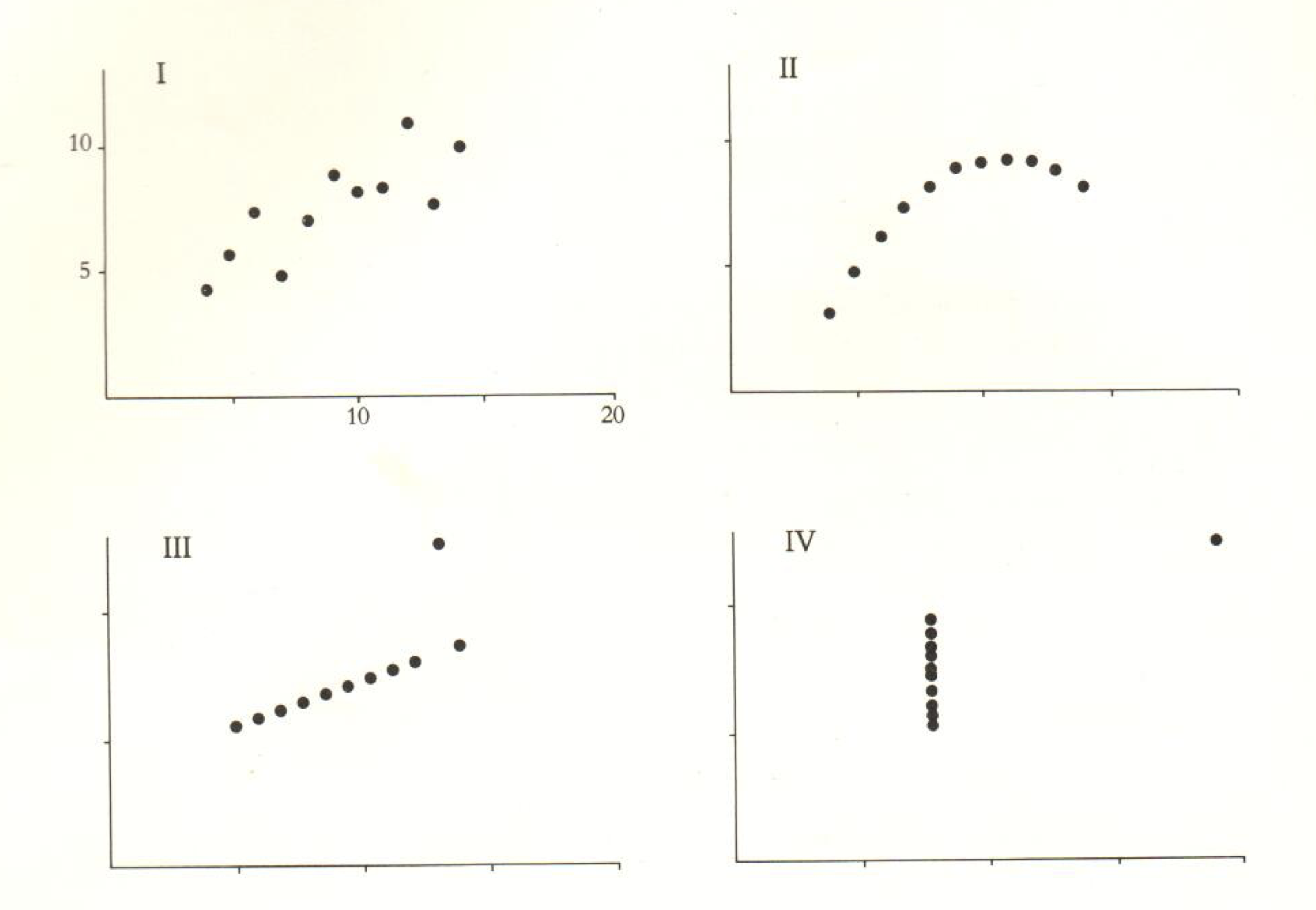](../../../../../post/2018-05-16-review-of-tufte-s-the-visual-display-of-quantitative-information_files/figure-html/unnamed-chunk-1-1.png)
Figure 1: Anscombe Data, 4 different datasets with same linear regression estimation (Beta, Sigma, and R^2), image link
- When graphics?: Maybe more “When not graphics” - Twice in the text (pg 20 and pg 178), Tufte states that “Tables usually outperform graphics in reporting on small data sets of 20 numbers or less”.
1. Don’t Lie / Distort the Data / Mislead the Reader
Distortion in graphics comes in many shapes and sizes. One can lie with graphics by changing scales so correct comparisons are hard or impossible (Lie factor, design variation, not data variation, lack of data standardization), one can trick the reader through abusing visual expectations (changes in multiple dimensions for the same variable), and one can confuse the reader with poor labeling and ambiguity in presentation.
Tufte sets out principles to avoid such distortions with the following guidelines:
Graphical integrity is more likely to result if these six principles are followed:
- The representation of numbers, as physically measured on the surface of the graphic itself, show be directly proportional to the nubmer of guantities represented.
- Clear, detailed, and thorough labeling should be used to defeat graphical distortion and ambiguity. Write out explainations of the data on the graphic. itself. Label important events in the data.
- Show data variation, not design variation
- In time-series displays of money, deflated and standardized units of monetary measurments are nearly always better then nominal units.
- The number of information-carrying (variable) dimensions depicted should not exceed the number of dimensions in the data.
- Graphics must not quote data out of context.
(pg 77)
Below I propose a slight reordering of these guidelines, and organize them in the 3 sections below.
1.1 Represent the data as truthfully as possible
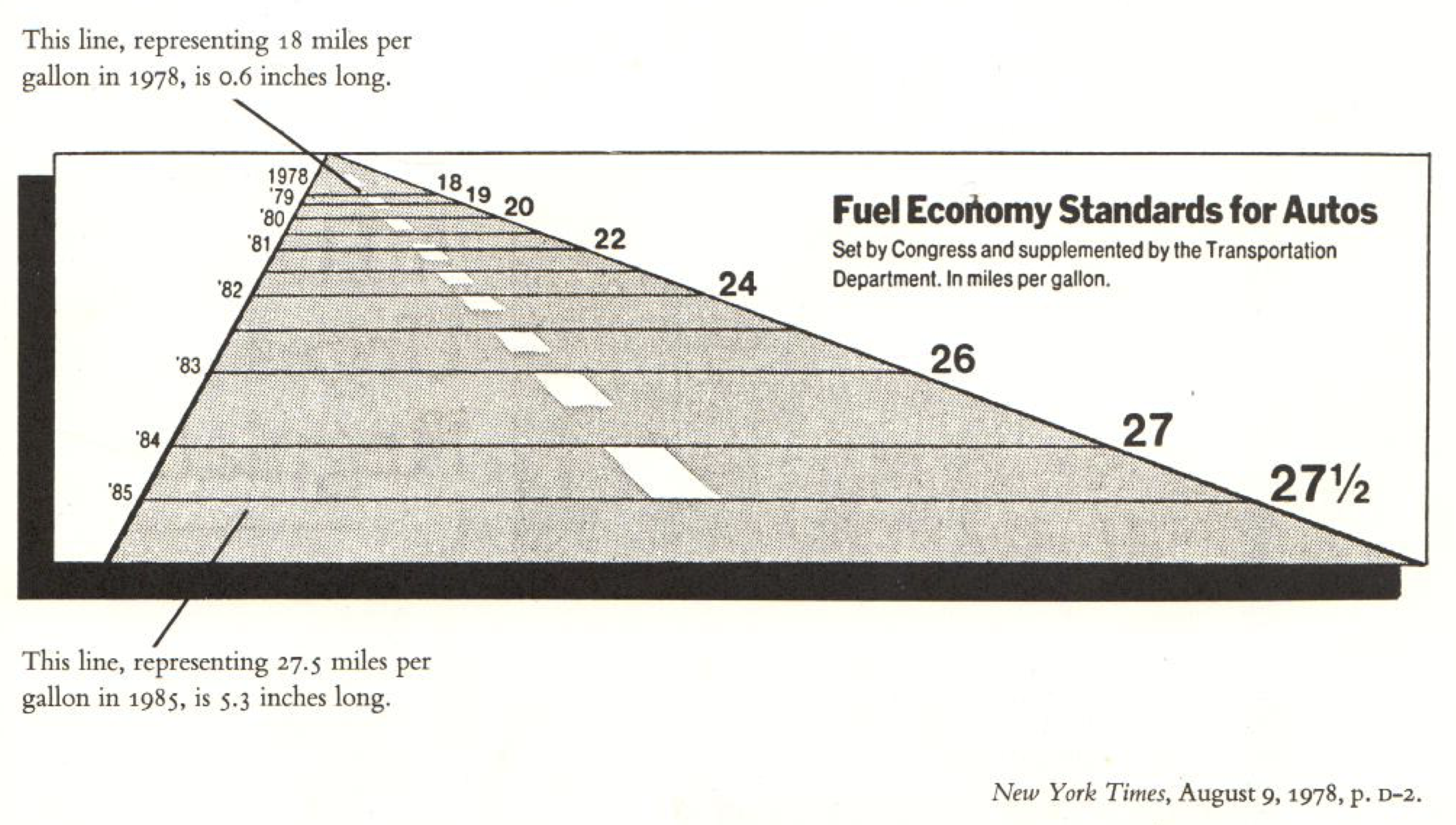](../../../../../post/2018-05-16-review-of-tufte-s-the-visual-display-of-quantitative-information_files/figure-html/fuel-1.png)
Figure 2: Fuel Standards Graphic From the NY Times image link
First, The most basic type of distortion comes when a graphic misrepresent the data so that the relationships between the representations of the data don’t preserve the true relationships between the data points. Though a little distortion in this regards might be ok, graphics like figure 2 distort the data too much. Tufte proposes we use the following metric:
\[\text{Lie Factor} = \frac{\text{size of effect shown in graphic}}{\text{size of effect in data}}\]
Using this metric, we can see that although the true change in fuel economy standards from ’78 to ’85 was a \((27.5-18)/18 = 53\%\) change, the chart shows it as a \((5.3-.6)/.6 = 783\%\), or a Lie factor of \(14.8\), where we’d hope for a number around \(1\) (note this example is just a re-presentation of the comments from Tufte).
Although distortion from this type of “design variation instead of data variation” is more rare in statistical graphics from the scientific community, it does showcase a worrisome abuse of visualization. In statistical graphics we may be more prone to see this type of direct distortion from manipulation of axes (which can be acceptable if they are pointed out) and incorrect treatment of the data points themselves.
Relative to incorrect treatment of the data points, implicit distortion of true changes across time or across different groups in economic data can occur if the graphic creator is utilizes non-standardized or non-deflated versions of the data. Examples commonalty include using nominal prices instead of real prices ($ units in fixed units across time to account for inflation, etc), and use of total units instead of rates like GDP vs GDP per capita.
1.2 Avoid abusing assumptions usually associated with the graphic
Second, abusing visual expectations of readers can lead to implicit distortion. Tufte’s favorite example is graphics that show change in 1 variable but visualize the change in multiple dimensions of an object (either 2 or 3 dimensional). Figure 3 showcases an example where both the height and the width of the doctor relates to the change in the ratio of doctors per person. Sadly, such things cause a multiplier effect, having the reader see \((\text{proportion change})^2\) instead of the true proportion changed.
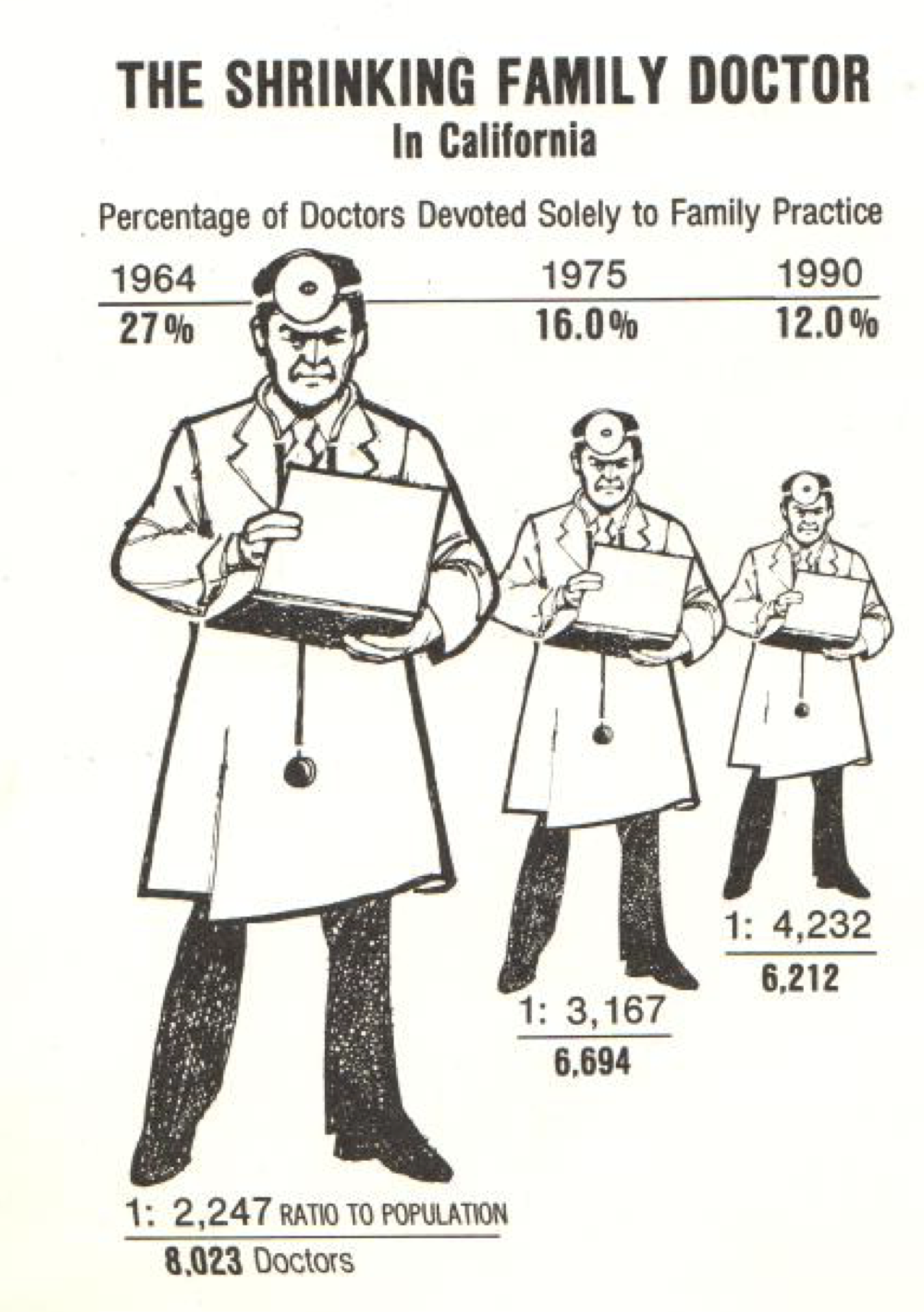](../../../../../post/2018-05-16-review-of-tufte-s-the-visual-display-of-quantitative-information_files/figure-html/doc-1.png)
Figure 3: Shrinking Doctor Graphic from LA Times. image link
If one has read Cleveland’s texts, we’re really looking at a compounding of direct distortion and the fact that readers have a harder time correctly estimating changes in area (even though in this graphic they should be just looking at changes in height).
1.3 Avoid misleading readers with good labelings
Luckily, we can avoid and reduce misleading the reader by providing good captions and detailed labeling. For example, it’s common practice to select the range of y values of a scatter plot to regions that the data point lies, if at the same time one makes sure that important values (like \(0\), \(100\%\), etc) are either specially marked or commented on their missingness in captions can reduce potential misleading.
2. Cleaning up your graphics
Maybe one of Tufte’s most remembered views is that Tufte thought graphics tended to have too much ink on them. Although sadly, this is generally associated with his extreme example show in figure 4, his ideas and recommendations have merit.
](../../../../../post/2018-05-16-review-of-tufte-s-the-visual-display-of-quantitative-information_files/figure-html/extemereduct-1.png)
Figure 4: An extreme example of Tufte’s reduction in unnecessary ink in graphics. Tufte proposed moving from the figure on the left, to the reduced figure on the right (the center is what was dropped out) image link
To avoid unnecessary ink on graphics, Tufte proposed the following metric :
\[ \text{Data-ink ratio} = \frac{\text{data related ink}}{\text{total ink used to make graphic}} \]
Figure 4 was just an example of reducing unnecessary ink (redundant) to make the amount of ink in the graphic minimalist.
Tufte generally recommends that one “maximize(s) the data-ink ratio, within reason” (italics are mine). Smart reductions is pointless and unnecessary ink can include removing excessive grids (especially dark grids) or removing color added for no reason. Reduction of redundancies in graphics can be very smart, maybe not to the extreme of figure 4, but removing redundant text number above points showcasing the numbers, and removing color differences in places where the axis or another variable already captures the distinctions is a good idea.
What doesn’t come out immediately is that this kind of redundant and unnecessary ink can naturally be added by standard computer graphics packages like ggplot2 in R and more. On of my favorite quotes from Tufte addresses this problem:
… at least a few computer grpahics only evoke the response “Isn’t it remarkable that the computer can be programmed to draw like that?” instead of “My, what interesting data.” (pg 120)
This can manifest itself with the example provided above as well as excessive number of axis markings (even where no data points lie) and the interest in creating “pretty graphics” when a table might do better. This is more addressed in section 4.
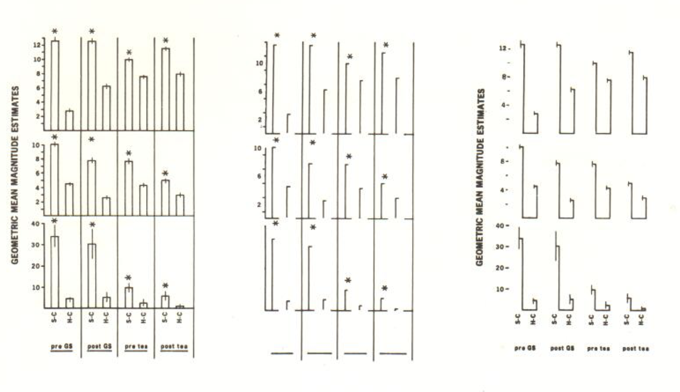
For the reader interested in cool applications / recommendations that follow this reduction of redundant data-ink, Tufte does propose good ideas to convert graphics like box plots to more simplistic graphics (see figure 5) and redesigns of scatter plots (keeping the actual points) is pretty smart use of the principles (chapter 6).
](../../../../../post/2018-05-16-review-of-tufte-s-the-visual-display-of-quantitative-information_files/figure-html/boxreduction-1.png)
Figure 5: Data-ink ratio increase to create a new type of box plot image link
3. Create Graphics that Showcase Complex Ideas
I really appreciate Tufte’s approach on this topic of pushing the expectation that graphics should showcase complex ideas. In his text he walks through a sampling of publication of his day and focused on how many didn’t spend that much time with complex graphics (lots with 1d visualizations or no statistical graphics taking up a large proportion of the graphics).
In light of this (or in spite of this), Tufte does a decent job arguing for complex ideas to be displayed in graphics.
More information is better than less information, especially when the marginal costs of handling and interpreting additional infomration are low, as they are for most graphics. (pg 168)
As I think we’ve seen this type of pattern by now, Tufte developed a basic equation to optimize in order to get people to think about getting more complex data into the same graphical space, namely:
\[ \text{data density of a graphic} = \frac{\text{number of entries in data matrix}}{\text{area of data graphic}} \]
Tufte wrote “maximize data density (…) within reason” (pg 168, italics are mine). Which makes sense as, when people have low “data density”, the reader is often left with questions about “what has been left out?” or “what if this trend was caused by other variables?”. On the other hand, visuals with a high “data density” must be designed with care, as elements like color and shapes have the potential to overwelm readers if not used correctly.
This push for a high “data density”/ complex visuals brought up a wonderful tool in graphics, which I like calling coplots (from Cleveland meaning “Conditional plots”), but more generally Tufte just introduced the use of multiple grids to increase data display. Each grid can showcase a new time increment, a different class from a new dimension and more.
Moreover, this complex graphics tend to help us focus on complex comparisons and efficiently using the “ink” we have to show complex patterns.
Tufte summarized the strength of complex graphics (specially multiple grids):
Well desinged small multiples are
- inevitably compariative
- deftly multivariate
- shrunken, high-density grpahcis
- usually based on a large data matrix
- drawn almost entirely with data-ink
- efficient in interpretation
- oftern narrative in content, showing shifts in the relationship between variables as the index variable changes (thereby revealing interaction or multiplicative effects).
(pg 175)
4. Best Graphics
To me, an easy but good summary of how we should approach the creation of graphics and the inclusion of graphics in statistical writing lies in the final chapter of Tufte’s book (a short read- can be found here).
To start off with 2 quotes:
Graphical elegance is often found in simplicity of design and complexity of data. (pg 177)
Attractive displays of statistical information
- have a propertly chosen format and design (**)
- use words, numbers, and drawing together (**)
- reflect a balance, a proportion, a sense of relevant sale
- display an accessible complexity of detail
- often have a narrative quality, a story to tell about the data (**)
- are drawn in a professional manner, with the technical details of production done with care (**)
- avoid content-free decoration, including chartjunk (**)
(pg 177)
I “(**)”ed the ones I liked / found most strongly connected to my views. In other words, make full use of our communicative tools (text, numbers and graphic) to display something with a clear narrative in a professional graphic clear of graphical elements that are not useful.
To put an attractive display into a report, one should (1) make sure the caption for the graphic helps the reader’s eye understand the graphic and avoid forcing the reader to jump back and forth with the real text and (2) make sure to put enough text and labels in the graphic for the reader to quickly pick up relevant points (3) make sure the graphics are included close to the text that is related to it (I’m talking to you \(\LaTeX\)).
This chapter also comes back to the idea that the best form to express information might be even be a table (I really appreciated figure 6’s table as a non-trivial example of this). I think in classes like 36-315 we focus a lot of which is the best graphic, but sometimes even another step back is wise.
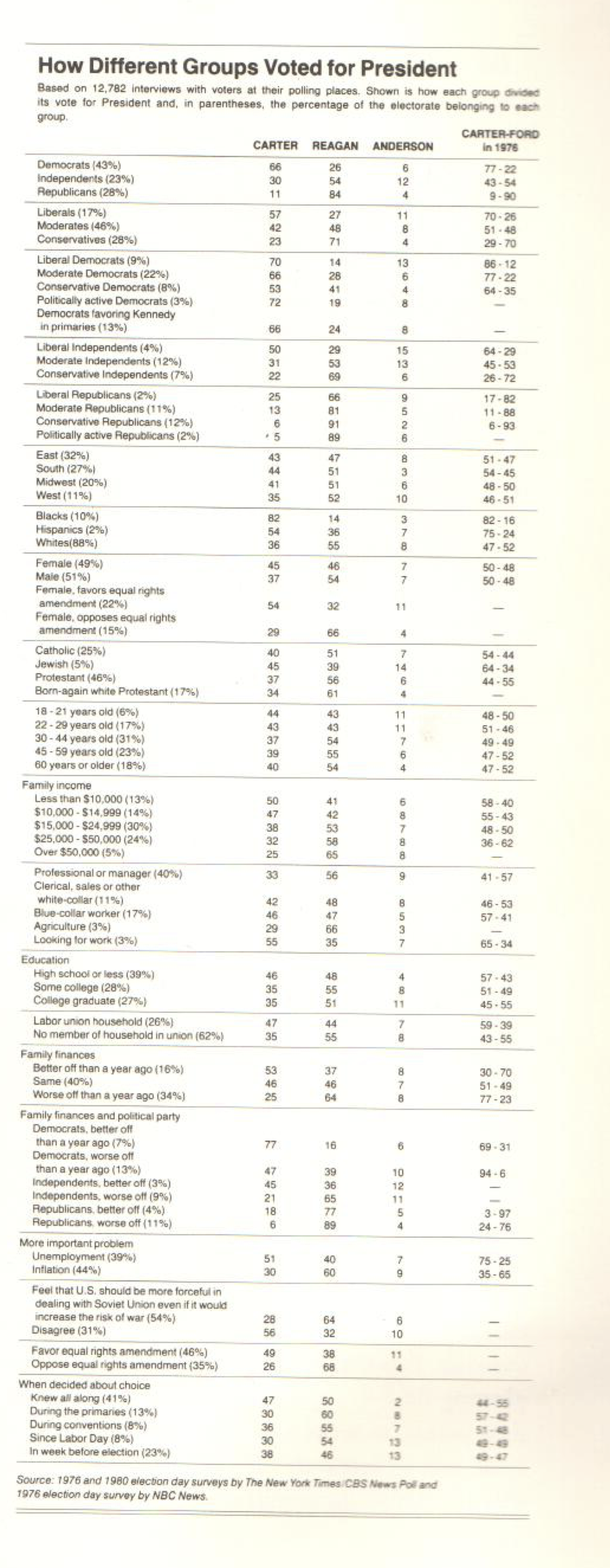](../../../../../post/2018-05-16-review-of-tufte-s-the-visual-display-of-quantitative-information_files/figure-html/tablefig-1.png)
Figure 6: An example where a complex data set (votes on the president per demographic group) has the potential to best be presented in a table. image link
4.4 Extra Table by on attributes of a “friendly data graphic”, one what is accessibly and open to the eye. From page 183.
](../../../../../post/2018-05-16-review-of-tufte-s-the-visual-display-of-quantitative-information_files/figure-html/friendlytable-1.png)
Figure 7: Attributes of a friendly graphic. image link