I decided to post this old lecture (with some clean up) online, as I think it really well captures a lot of things students might want to know about logistic regression while using R. Note: this document was written for summer students in CMU Statistics and Data Sciences’ SURE program, and was presented to them live.
Introduction
This lecture focuses on introducing a set of tools associated with logistic regression.
Today we’re going to use a pretty basic dataset. There are reasons for this (we’ll see this later). This data is from the Institute of Digital Research and Eduation at UCLA. This lecture is a combination of lots of other people’s work and texts.

grad_admit <- read_csv("https://stats.idre.ucla.edu/stat/data/binary.csv") %>%
  mutate(admit = factor(admit),
         rank = factor(rank))
The data (explorable below) contains a set of features associated with ‘students’ records for students that applied to UCLA, with a binary variable (admit) which indicates where or not the student was admitted.
library(DT)
DT::datatable(grad_admit, options = list(autoWidth = "TRUE"))
Quick EDA
It’s standard (and good practice) to explore the data. Below is provided some 1d and 2d visualizations. I would encourage the reader the look into the data and think about the variables we have, how they are distributed and how they relate to each other.
1D EDA
Quick look at the distributions (using a function basically wrote on Friday) - feel free to look at it later.
# Create grid of 1d visuals of variable distributions in data frame
# Args:
#   data: data frame you'd like to explore
#   ncol: number of columns for the visual output
#
# Returns:
#   list of graphics
#   and creates the correct visualization
gg1d <- function(data, ncol = 3){
  require(gridExtra)
  require(ggplot2)
  columns <- names(data)
  types <- sapply(data, class)
  num_types <- c("numeric", "integer")

  gglist <- list()

  for (i in 1:length(columns)) {
    if (types[i] %in% num_types) {
      gglist[[i]] <- ggplot(data, aes_string(x = columns[i])) +
        geom_histogram()
    }else{
      gglist[[i]] <- ggplot(data, aes_string(x = columns[i])) +
        geom_bar()
    }
  }
  grid.arrange(grobs = gglist, ncol = ncol, top = "1d EDA")
  return(gglist)
}
# saving it as "." is a way to ignore the returned list (it still is saved,
# but "out of sight, out of mind")
. <- gg1d(grad_admit, ncol = 2) 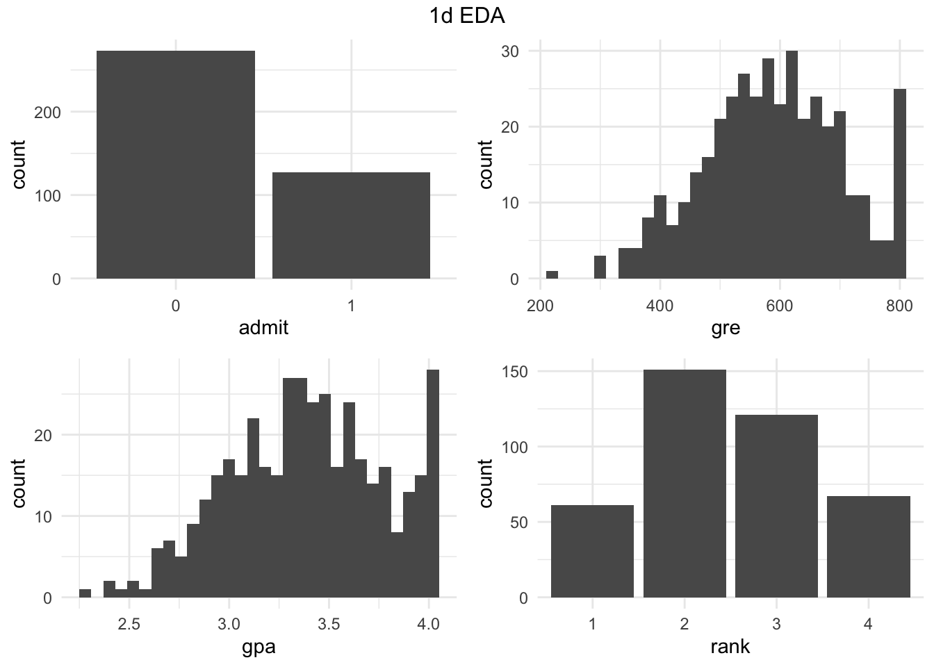
Extra Pairs Plot
library(GGally)
ggpairs(grad_admit)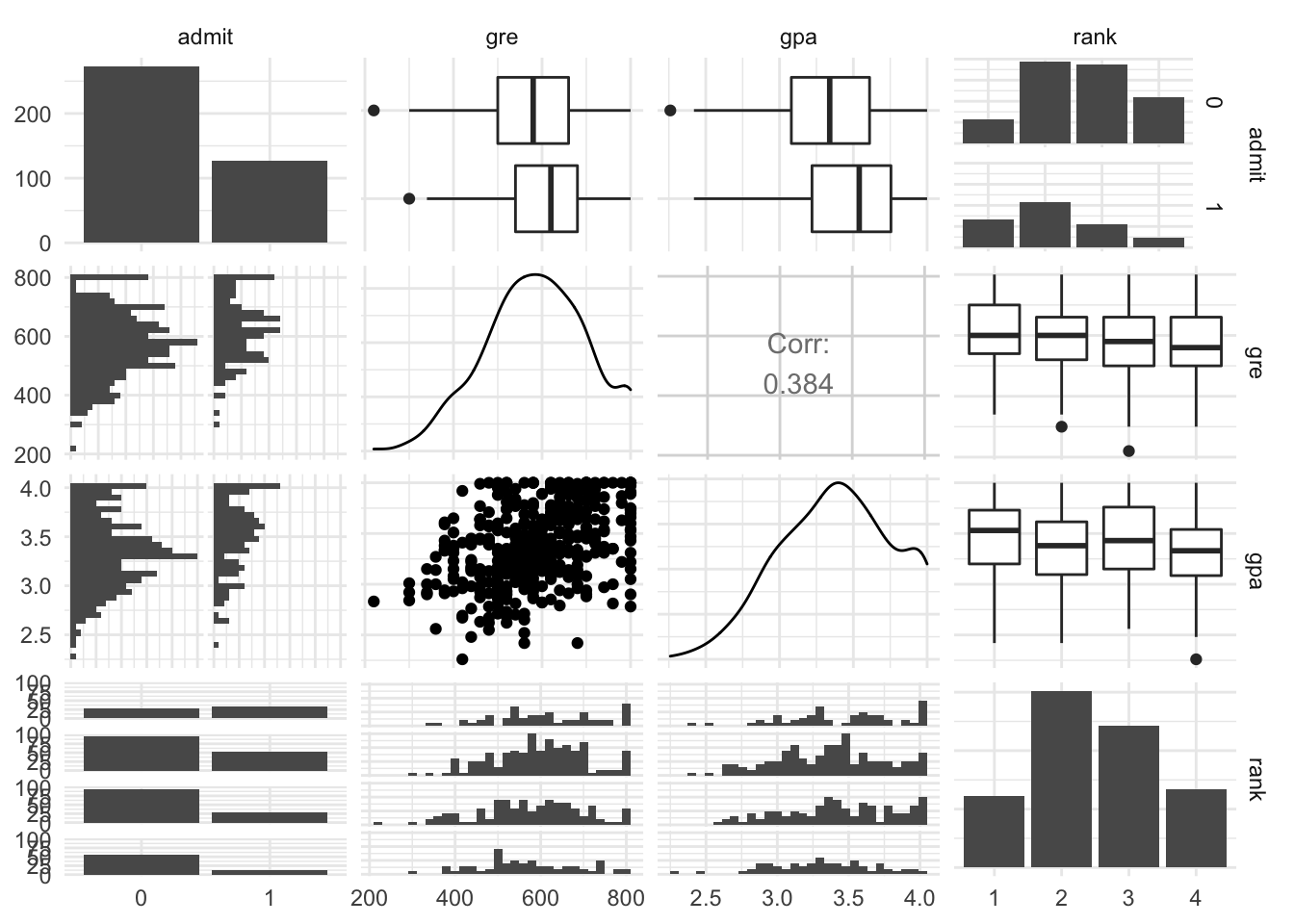
Logistic Regression
Quick training/ test split
Before we proceed we will split the data into 2 groups so we can use the second group in assessing model preformance.
train_idx <- sample(1:nrow(grad_admit), size = .5 * nrow(grad_admit))

ga_train <- grad_admit %>% filter(1:nrow(grad_admit) %in% train_idx)
ga_test  <- grad_admit %>% filter(!(1:nrow(grad_admit) %in% train_idx))
Here’s our logistic regression model (we comment on the structure below).
logit_fit <- glm(admit ~ gre + gpa + rank, data = ga_train,
               family = "binomial")
summary(logit_fit)
##
## Call:
## glm(formula = admit ~ gre + gpa + rank, family = "binomial",
## data = ga_train)
##
## Deviance Residuals:
## Min 1Q Median 3Q Max
## -1.5171 -0.8152 -0.5776 1.0396 2.1894
##
## Coefficients:
## Estimate Std. Error z value Pr(>|z|)
## (Intercept) -5.4897680 1.7895536 -3.068 0.00216 **
## gre 0.0009141 0.0015807 0.578 0.56305
## gpa 1.4457858 0.5353035 2.701 0.00692 **
## rank2 -1.0321076 0.4799678 -2.150 0.03153 *
## rank3 -0.8888721 0.5036715 -1.765 0.07760 .
## rank4 -1.7703847 0.6011894 -2.945 0.00323 **
## ---
## Signif. codes: 0 '***' 0.001 '**' 0.01 '*' 0.05 '.' 0.1 ' ' 1
##
## (Dispersion parameter for binomial family taken to be 1)
##
## Null deviance: 239.05 on 199 degrees of freedom
## Residual deviance: 216.35 on 194 degrees of freedom
## AIC: 228.35
##
## Number of Fisher Scoring iterations: 4Summary Breakdown
Let’s break down this summary.
When we ran the logistic regression we were looking at:
admit ~ gre + gpa + rankWhich could be mathematically represented \[\begin{align} logit(p) \sim & \beta_0 + \beta_1 \cdot gre + \beta_2 \cdot gda \\ & + \beta_3 \cdot \mathbb{I}(rank = 2) \\ & + \beta_4 \cdot \mathbb{I}(rank = 3) \\ & + \beta_5 \cdot \mathbb{I}(rank = 4) \end{align}\] where \(p = \mathbb{E}(Y|gre,gda,rank)\) and \(logit(p) = \log(\frac{p}{1-p})\).
So, we really have 6 \(\beta\) values that we’re estimating even though the code looks like we are only looking at 3 columns.
Question 1: What happened to rank == 1? (I read Chad talked about something like this.)
Answer: If we had a column in the model matrix for the indicator \(\mathbb{I}(rank = 1)\), then would not have linearly independent columns. Specifically, the \(\beta_0\) in the equation means the our model matrix has a column of all \(1\)s. We know that \(1 = \sum_{r=1}^4 \mathbb{I}(rank = r)\) (which is the same as saying these sets of columns are linearly dependent). This would mean the model wouldn’t know what to estimate for \(\beta_0\) and the \(\beta\)s related to rank.
rank == 1is the ‘base’ or ‘benchmark’ group.
\(\beta\) interpretation
Raw \(\beta\) values
logit_fit %>% coef %>% round(3)## (Intercept) gre gpa rank2 rank3 rank4
## -5.490 0.001 1.446 -1.032 -0.889 -1.770Question 2: What is the interpretation in linear regression (we are not using a linear regression)?
Answer: If this was linear regression, for coefficients like \(\beta_{gpa}\) we would interpret the value of 1.446 as meaning that for every 1 unit increase of
gpawe would expect to see an increase in a continuous prediction by .616 units. Note, that a smart person might multiple thegpacoeffiecent by .1 and then discuss the change relative to a .1 unit increase ofgpaas that seems more likely / useful. Additionally, for our \(\beta_{rank2}\) style coefficients, it’s common to interpret these relative to our ‘base’ / ‘benchmark’ group, that is, if we moved a student fromrank1torank2the model would predict a decline in our continuous prediciton by .273 units.
To interpret logistic regression \(\beta\) values, I would encourage you to first think back to our linear equation that expressed the logistic regression model. The following steps capture how to get a clearer intepretation of the \(\beta\) values:
Converted \(\beta\) values
Instead of looking at the change of the logit(p) for a unit of the explaintory variable, let’s think about how to get something more meaningful.
Instead of change in log(p/(1-p)) we can look at change in p/(1-p)
logit_fit %>% coef %>% exp## (Intercept) gre gpa rank2 rank3 rank4
## 0.004128802 1.000914546 4.245186778 0.356255325 0.411119190 0.170267473Since we should really be thinking about looking taking the \(e^{side}\) for both sides in our original equation, as such these elements now relate to a multiplicative effect.
That is we might interpret \(e^{\beta_2}\) in the following manner:
For every unit increase in gpa we’d expect to see the individual’s odds of acceptance to be increased by a multiple/factor of 4.245.
Confidence Intervals for \(\beta\) values
With the base \(\beta\) values and the converted \(\beta\) values we can get confidence intervals:
base_beta_ci <- logit_fit %>% confint()
base_beta_ci
## 2.5 % 97.5 %
## (Intercept) -9.123496602 -2.079423926
## gre -0.002185674 0.004038365
## gpa 0.421899116 2.529627923
## rank2 -1.986931934 -0.093554261
## rank3 -1.892276543 0.093948393
## rank4 -3.011408184 -0.629942791transformed_beta_ci <- base_beta_ci %>% exp
transformed_beta_ci## 2.5 % 97.5 %
## (Intercept) 0.0001090726 0.1250022
## gre 0.9978167131 1.0040465
## gpa 1.5248546833 12.5488361
## rank2 0.1371154601 0.9106886
## rank3 0.1507282785 1.0985031
## rank4 0.0492223159 0.5326223Goodness of Fit, Deviance, and Dispersion
Like the F test in linear regression, we can examine the null hypothesis that the model doesn’t explain anything more than noise compared to the null model. We do this with the change of deviance of the model deviance. Deviance is defined as \(- 2 \cdot loglikelihood(model)\).
A quick reminder about log likelihoods related to some common linear models.
| type | likelihood | log likelihood |
|---|---|---|
| Normal | \(\prod_i \frac{1}{2\sigma^2} e^{-(y_i-\beta^t x_i)^2/\sigma^2}\) | \(-n\log(2\sigma^{2}) - \frac{1}{\sigma^2}\sum_i (y_i-\beta^t x_i)^2\) |
| Binomial | \(\prod_i \hat{p}^{y_i}(1-\hat{p})^{1-y_i}\), where \(\hat{p}_i = \frac{e^{\beta^t x_i}}{1+e^{\beta^t x_i}}\) (from algebraic manipulation of \(\log(\frac{\hat{p}_i}{1-\hat{p}_i}) = \beta^t x_i)\)) | \(\sum_i y_i \log(\hat{p}_i) - \sum_i (1-y_i) \log(1-\hat{p}_i)\) |
| Poisson | \(\prod_i \frac{({\hat{\lambda}_i}^{x_i}) e^{-\hat{\lambda}_i}}{x_i!}\), where \(\hat{\lambda}_i = e^{\beta_t x_i}\) (from algebraic manipulation of \(\log(\hat{\lambda}_i) = \beta^t x_i)\)) | \(\sum_i -\hat{\lambda}_i - \log(x_i!) + x_i \log(\hat{\lambda}_i)\) |
The bigger the difference (or “deviance”) of the observed values from the expected values, the poorer the fit of the model. Null deviance shows how well the response is predicted by a model with nothing but intercept. The difference in deviance is asymptotically \(\chi^2\), as such we can test to goodness-of-fit:
diff_deviance <- logit_fit$null.deviance - logit_fit$deviance

diff_df <- logit_fit$df.null - logit_fit$df.residual

pchisq(diff_deviance,df = diff_df,lower.tail = FALSE)
## [1] 0.0003854845A small p-value suggests our logistic model is better than the null. Significant reduction in deviance of the fitted model from the null model.
Warning: (@ 402 students) Althought the above test might be called a goodness of fit test, the more standard goodness of fit test is related to the question of how the current model fits vs the saturated model. In this situation, the deviance of the staturated model is actually \(0\), and although we can do a similar analysis (we still get a \(\chi^2\) distribution under the null), we instead examine:
pchisq(logit_fit$deviance, logit_fit$df.residual, lower.tail = FALSE)## [1] 0.1298283# which can also be expressed
# pchisq(logit_fit$deviance - 0, df(staturated model) - df(current model), lower.tail = FALSE)This is intrisically testing a different of hypothesis, in this test a small p-value suggests that our logistic model doesn’t well fit the data.
Dispersion
Unlike Normal Regression, logistic and poisson regression has another parameter (which effects the variance of the \(\beta\) values).
Just a quick reminder:
| type | mean | variance | distribution |
|---|---|---|---|
| Normal | \(\mu\) | \(\sigma^2\) | \(\frac{1}{2\sigma} e^{\frac{-1}{2\sigma^2}(x-\mu)^2}\) |
| Binomial | \(p\) | \(p(1-p)\) | \(p^x (1-p)^{(1-x)}\) |
| Poisson | \(\lambda\) | \(\lambda\) | \(\frac{\lambda^x e^{-\lambda}}{x!}\) |
Notice that for normal distributions the mean and variance are different parameters (and are estimated seperately), wherease in binomial and poisson they are not, this leads to the idea that the dispersion.
For the Binomial case, we allow for potential for the variance to be larger or smaller than expected (\(p(1-p)\) ) with dispersion,
\[ Var(y) = \phi p(1-p) \]
If \(\phi\) is statistically significant that 1, we tend to update the Variance estimates of \(\beta\)s with \(\phi\). Note, it’s actually best to estimate \(\phi\) with the fullest model (aka. when you’re doing model selection).
dispersion <- logit_fit$deviance/(
  nrow(grad_admit) - length(logit_fit$coefficients)
  )

dispersion
## [1] 0.5491049pchisq(logit_fit$deviance,logit_fit$df.residual,lower.tail = FALSE)## [1] 0.1298283Even though our dispersion is decently close to 1, our \(\chi^2\) test suggests its far enough away from 1 that we need to correct for it.
What causes over-dispersion? For a binomial model the most likely problem is correlation across the individual Bernoulli trials within each binomial outcome.
To conduct inference we must update the standard errors by multiplying by \(\sqrt{\phi}\).
Prediction / Fit Diagnostics
Now let’s get to evaluating the model, prediction and diagnostics.
Prediction
Since our model is looking to predict \(logit(\mathbb{P}(y = 1|X))\) we can look at objects’ predicted \(y\) value, or \(\logit{p}\) or even \(p\), in the following way:
pred_logit <- predict(logit_fit, newdata = ga_test)
pred_prob  <- predict(logit_fit, newdata = ga_test, type = "response")
pred_y     <- 1*(pred_prob > .5)
# explore all 3 above
How well would we do predicting the correct admit values for the training dataset? (Suppose we split on \(\hat{p} > .5\)).
mean(ga_test$admit == pred_y)## [1] 0.685Confusion Matrix
Generally for binary classification, we actually look at the confusion matrix,
| . | Predicted 1 | Predicted 0 |
|---|---|---|
| True 1 | True Positive | False Negative (type I) |
| True 0 | False Positive (type II) | True Negative |
We can examine the binary classification in R with:
table(ga_test$admit, pred_y)## pred_y
## 0 1
## 0 122 8
## 1 55 15ROC curves
By the logistic regression model holds more information that that - we have probabilities!, we can visualize how well the algorithm does with an ROC curve.
First, let’s do a visual and define some terms
vis_data <- data.frame(truth = ga_test$admit,
                       prob = pred_prob)
ggplot(vis_data, aes(x = prob, fill = truth)) +
  geom_histogram(position = "identity", alpha = .5)
## `stat_bin()` using `bins = 30`. Pick better value with `binwidth`.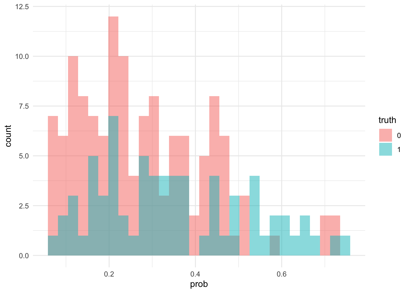
Notice that the algorithm does generally give higher probabilities to those admitted, but that cutting off at \(.5\) might now seem silly (this is probably due to differences in class memberships, which can be corrected with weighted regression - chad has talked about this).
But we can also imagine just cutting at a different probability… But which one?
Why not all of them ;)
For a specific threshold, we could calculate 2 metrics (don’t worry to much about them)
\[ TPR = \frac{\text{True Positives}}{\text{True Positives} + \text{False Negatives}} = \frac{\text{True Positives}}{\text{All Positives}}\]
\[ TNR = \frac{\text{True Negatives}}{\text{True Negatives} + \text{False Positives}} = \frac{\text{True Negatives}}{\text{All Negatives}}\]
If we plotted these values (or actually TPR and 1-TNR) we could get an ROC curve.
library(plotROC) # I don't like this library - I can give a better function, but for now...

ggplot(vis_data, aes(d = as.numeric(as.character(truth)),
                     m = prob)) +
  geom_roc() +
  geom_abline(slope = 1,intercept = 0) +
  labs(title = "ROC curve",
       x = "1 - TNR",
y = "TPR") 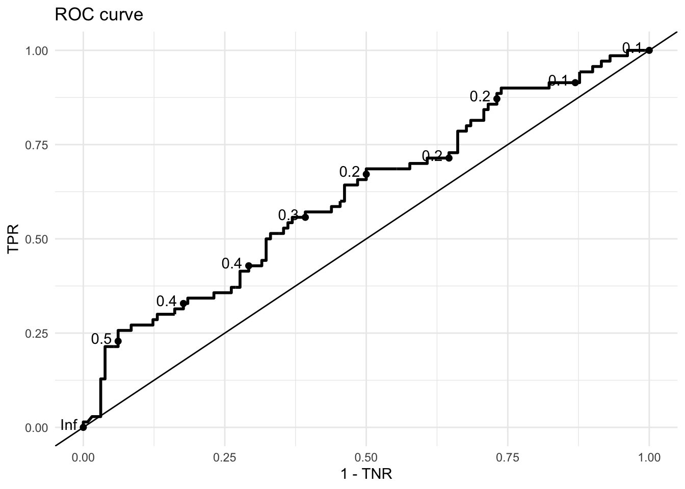
How to intepret ROCs
ROC curves show the tradeoff between changes in the threshold to True Positive Rates, proportion of class 1 correctly classified as class 1, and the same for class 0 (True Negative Rate).
- The closer the curve to the upper left border (0,1) the better,
- The closer to the
y = xline the worse the classifier (they = xline would be a classifier that either classifies all observations as0or1) - It is common to use the Area Under the Curve (AUC) to measure accuracy
We can caculate AUC using the same information in vis_data (the true classes and the probability estimates).
library(ROCR)
pred_obj <- prediction(predictions = vis_data %>% pull(prob),
           labels = vis_data %>% pull(truth))
roc_obj <- performance(pred_obj,x.measure = "fpr", measure = "tpr")
# plot(roc_obj) # base graphic
roc_obj_auc <- performance(pred_obj, measure = "auc")
roc_obj_auc@y.values[[1]]
## [1] 0.6178571Goodness-of-Fit Graphics
Chad talked about the Hosmer and Lemeshow goodness-of-Fit metric:
library(ResourceSelection)
hl_test <- hoslem.test(as.numeric(as.character(ga_train$admit)),
            logit_fit$fit,g = 10)

hl_test
##
## Hosmer and Lemeshow goodness of fit (GOF) test
##
## data: as.numeric(as.character(ga_train$admit)), logit_fit$fit
## X-squared = 16.389, df = 8, p-value = 0.03714Such a test is slightly finicky, I tend to like graphical visualization:
expected_vs_actual <- hl_test$observed %>% cbind(hl_test$expected) %>%
  data.frame %>%
  mutate(true_prop = y1/(y0 + y1),
         expected_prop = yhat1/(yhat1 + yhat0))

ggplot(expected_vs_actual, aes(x = expected_prop,
                               y = true_prop)) + geom_line() +
  geom_abline(slope = 1, intercept = 0, linetype = 2) +
  geom_point(data = vis_data, aes(x = prob,
                                  y = jitter(
                                    as.numeric(as.character(truth)),
                                    amount = .05
                                    )
                                  ),
             alpha = .2) +
  ylim(-.1,1.1) +
  xlim(0,1) +
  labs(x = "True Proportion/ True Response",
y = "Estimated Proportion") 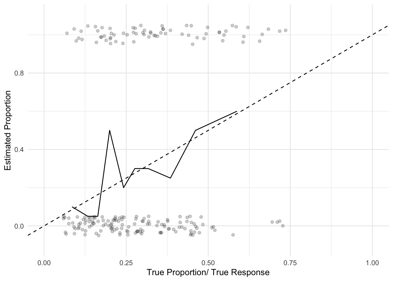
Additional Resources
More mathematical background for logistic regression: Cosma’s Textbook, Chapter 12
Background with
Rcode examples: Iowa StateDispersion review: Penn State Stat 504